Challenge
The Turbonomic acquisition presented a significant challenge for the Design team at IBM. Legacy sites needed migration into the IBM ecosystem while addressing critical UX gaps: poor product discoverability, siloed and repetitive content across pages, and incomplete information architecture compared to competitors. Competitive analysis revealed the site lacked dedicated navigation, comprehensive features documentation, and cohesive product storytelling—resulting in low engagement rates and minimal client interest.
Team: Annmarie Avila | Alexande Ku | Insaf Sulaiman | Carlos Ruiz | Joe Rodriquez | Uriel Hernández Torres | Kendall Carpenter | Judi Adolino | Michael Goodwin | Tristan Cobb | Delphine Giboyau
Impact
Competitive research & site audit
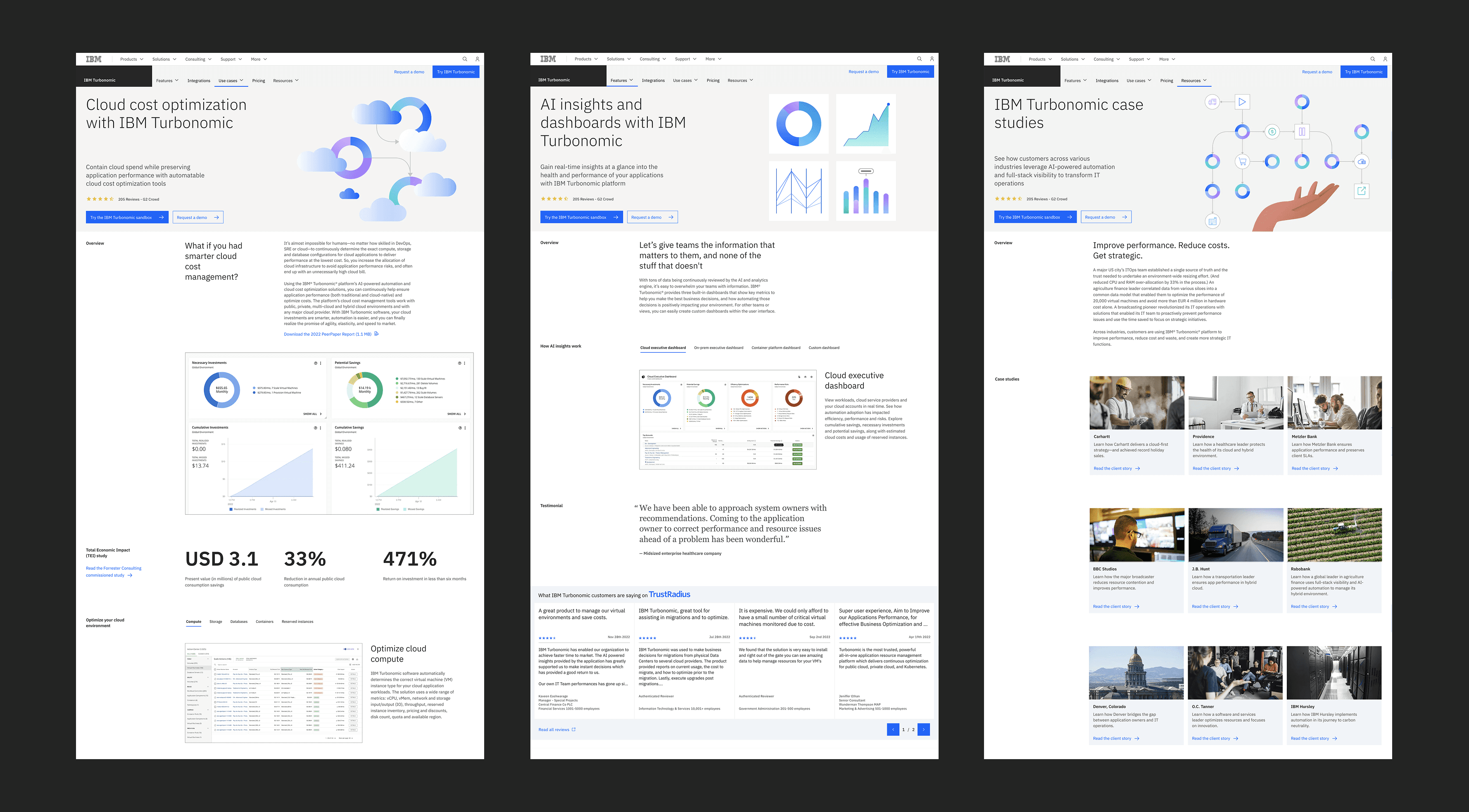
Competitive analysis revealed key gaps: the legacy Turbonomic site lacked dedicated Features, Use Cases, and Resources pages that competitors offered, resulting in poor product discoverability and fragmented content spread across multiple pages without clear hierarchy.
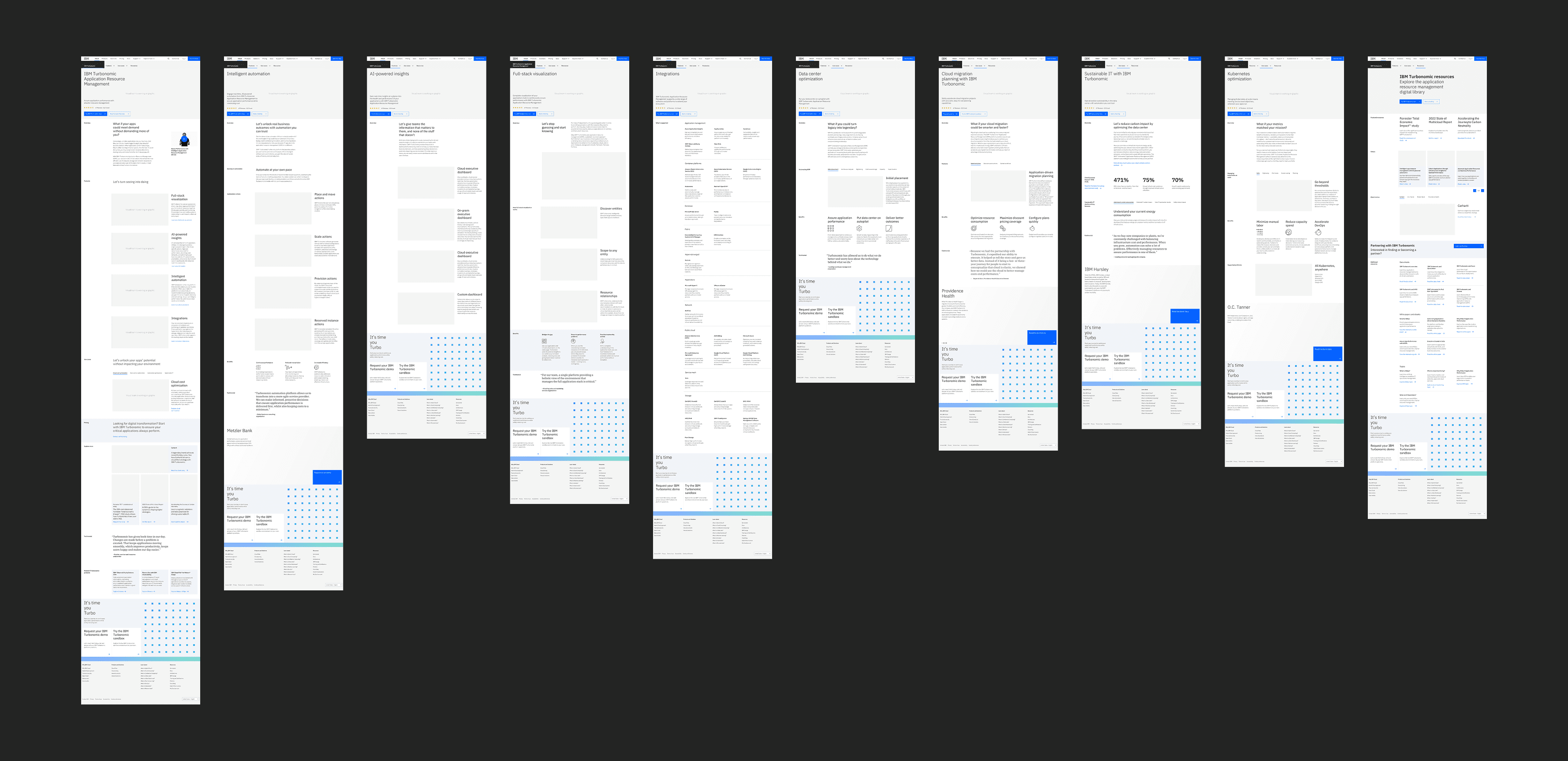
Wireframing
The team restructured navigation and introduced new Features, Use Cases, Integrations, and Resources pages to improve discoverability and user flow. Updated wireframes reflected enhanced L1 navigation designed to help visitors intuitively pursue their goals.
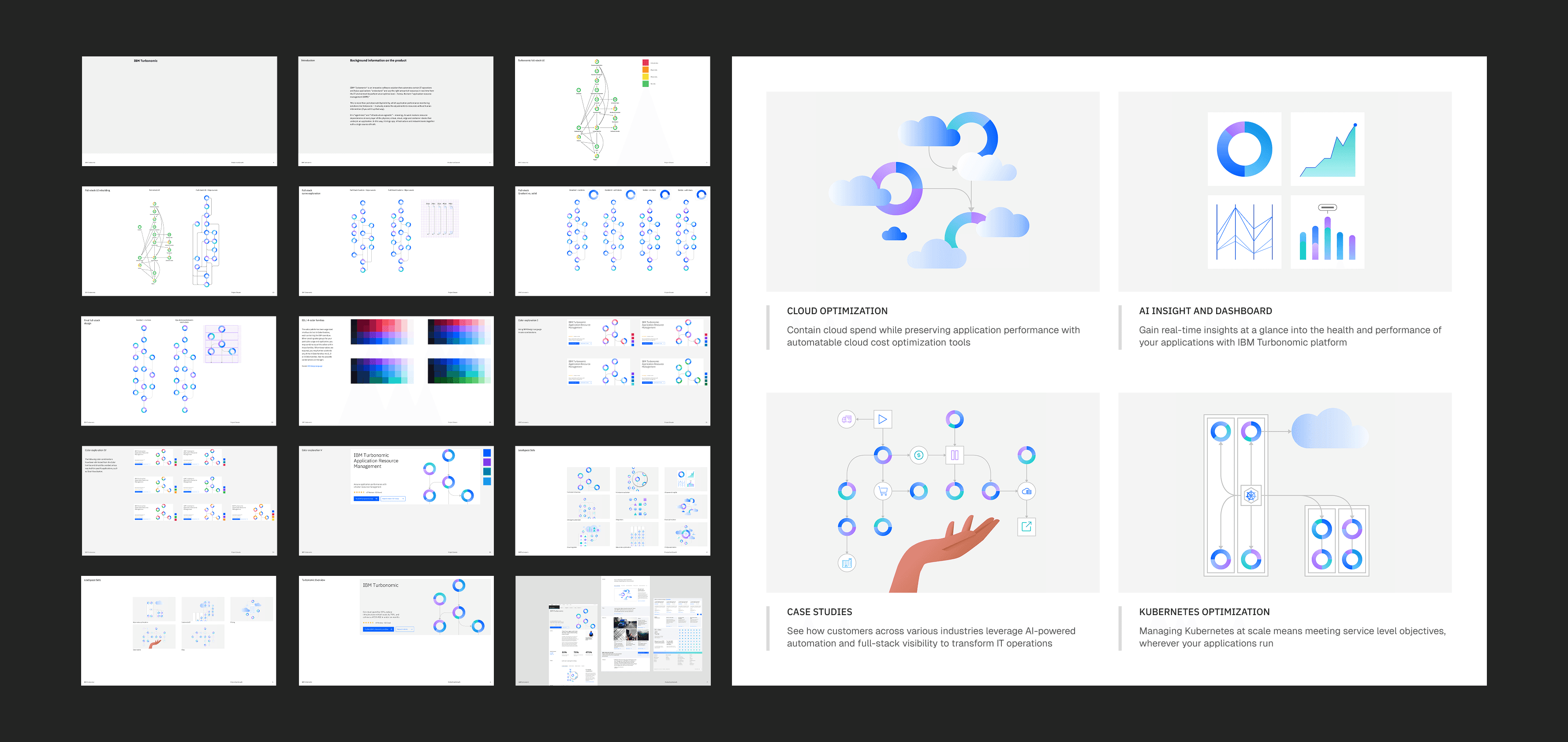
Visual expression
Visual approach combined line and flat illustration styles informed by product design. After exploring various colorways, the team selected blue/purple/teal/aqua palette to reinforce branding while addressing accessibility concerns—establishing a distinctive visual language for the product suite.
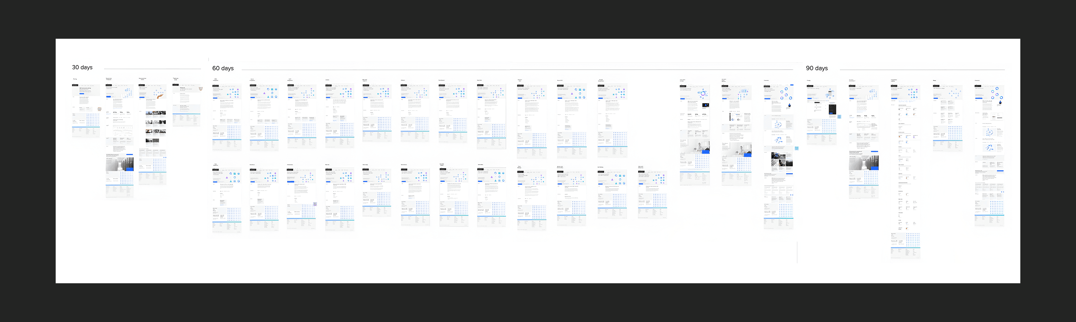
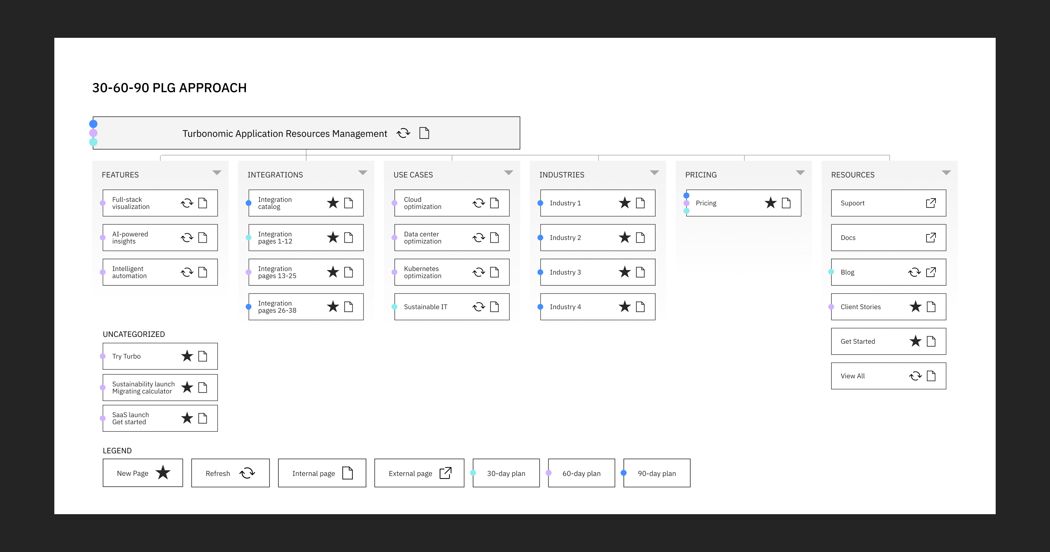
90-Day product-led-growth initiatives
After the initial site launch, a product-led growth (PLG) strategy was introduced to optimize the new experience and drive higher engagement. A 30-60-90 day plan was developed in collaboration with Product Marketing, Product Management, Digital Sales, and cross-functional teams. The initiative included building new pages, optimizing existing content, conducting SEO research, analyzing baseline performance metrics, developing updated site architecture, and creating targeted content. This structured approach established a foundation for measuring performance and iterating based on user behavior.
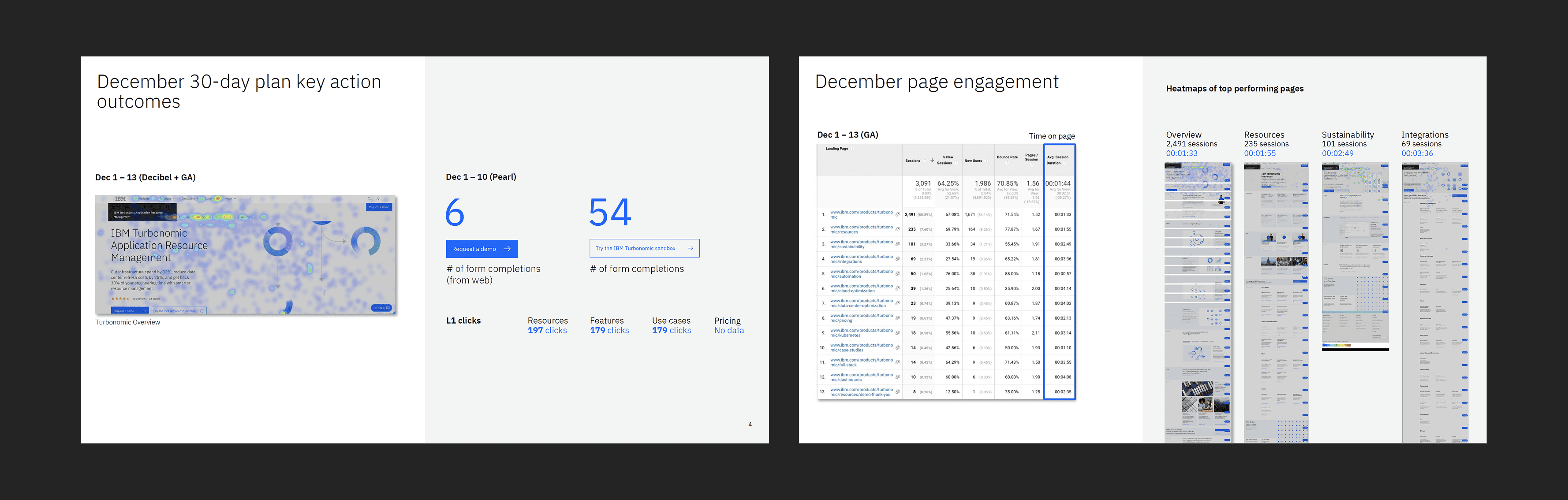
Decibel user analytics
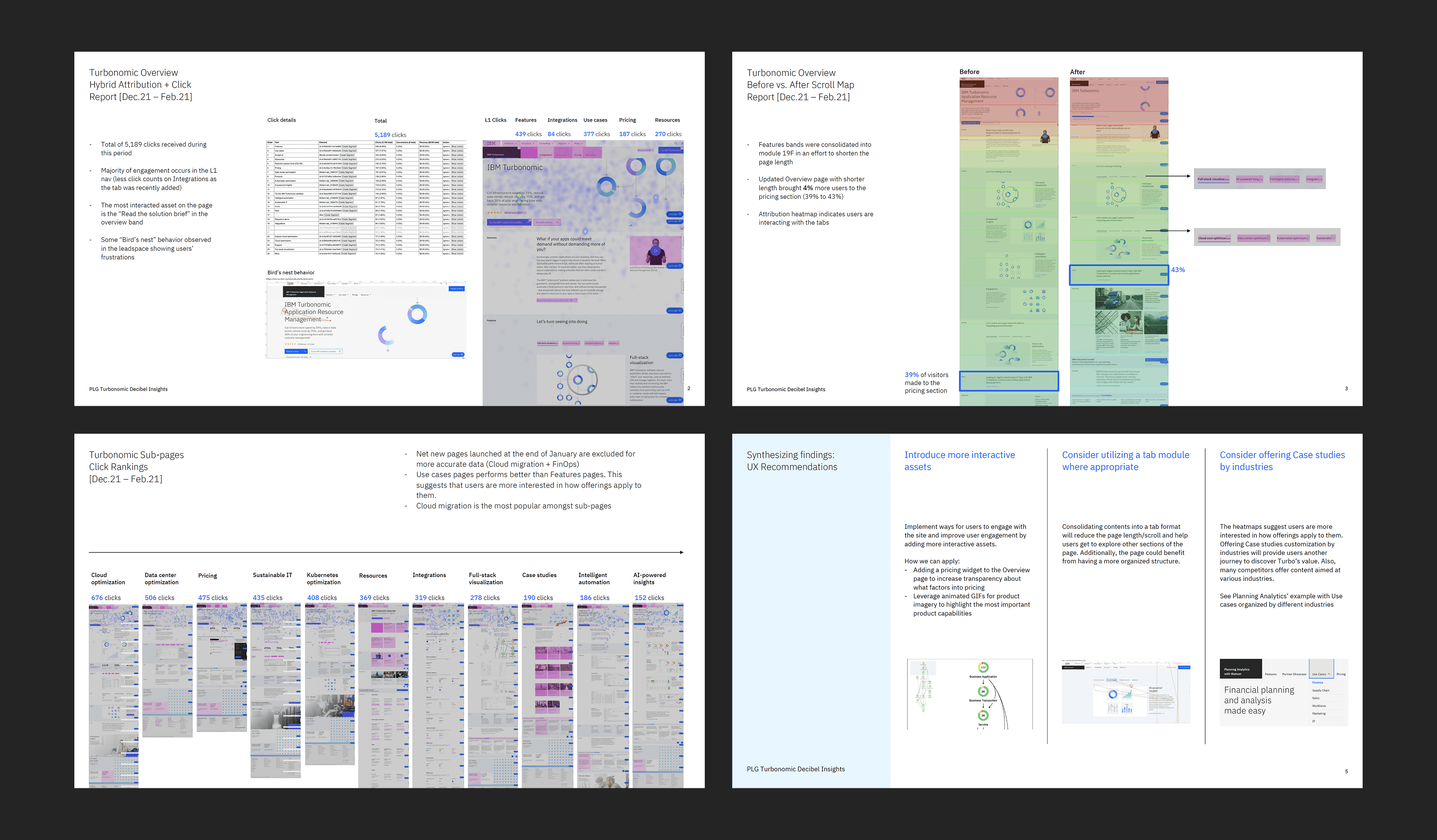
To drive continuous optimization, user behavior was monitored through Decibel analytics and heatmap analysis. These insights revealed critical patterns: the overview page contained too much information and generated low engagement below the fold, certain pages performed significantly better than others, and users had clear preferences for specific content types and navigational patterns. This data became the foundation for hypothesis-driven experimentation and design optimization.
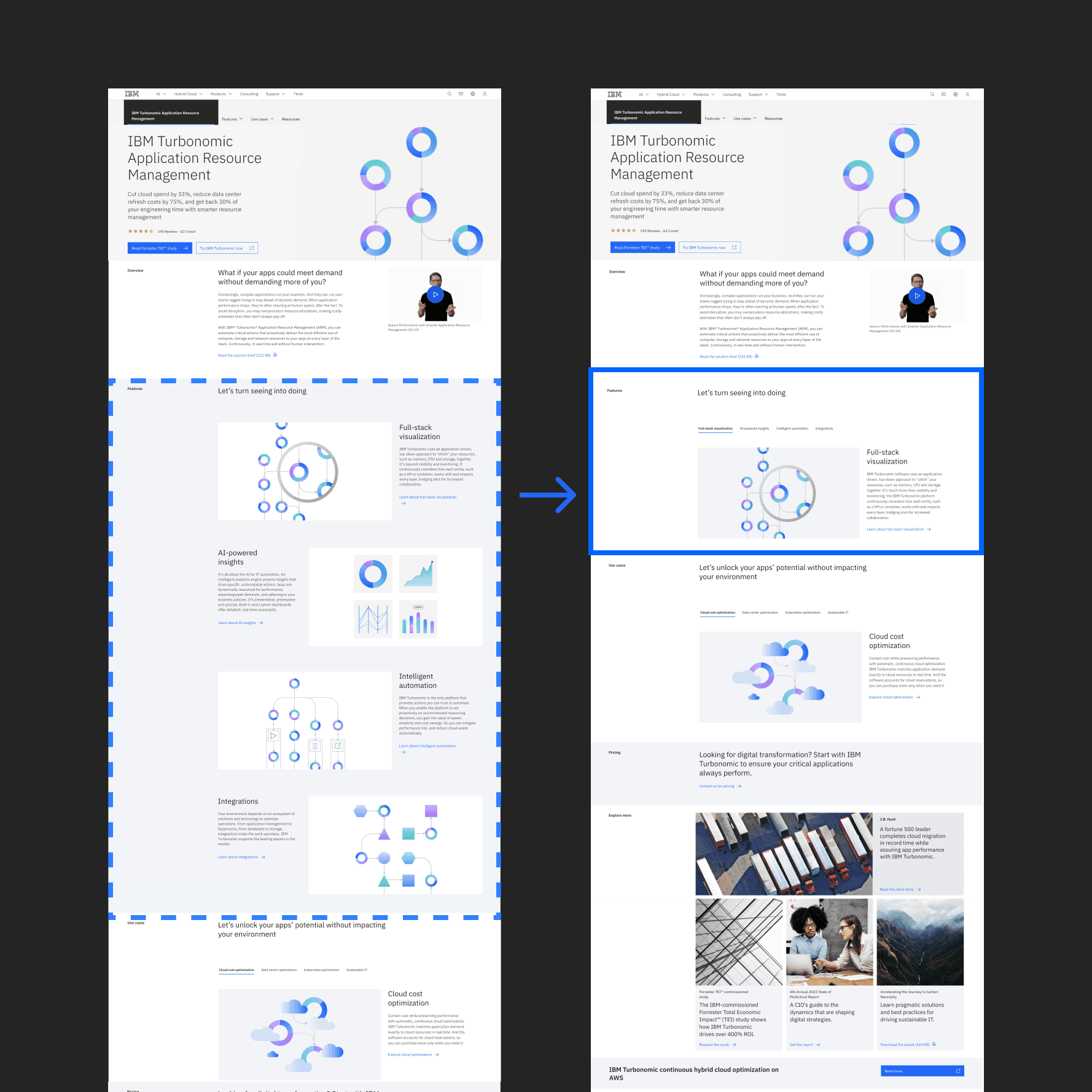
UX recommendation: tabbed approach
Hypothesis: Consolidating stacked feature modules into a tabbed format would encourage users to explore more content and reach the pricing section faster.
Implementation: The overview page was redesigned to replace stacked modules with tabbed navigation, reducing page length and improving content discoverability.
Result: After two months, the updated overview page brought 4% more users to the pricing section (39% → 43%). While incremental, this insight validated the effectiveness of tabbed modules—challenging the common assumption that users avoid tab interactions. This learning informed future optimization decisions.
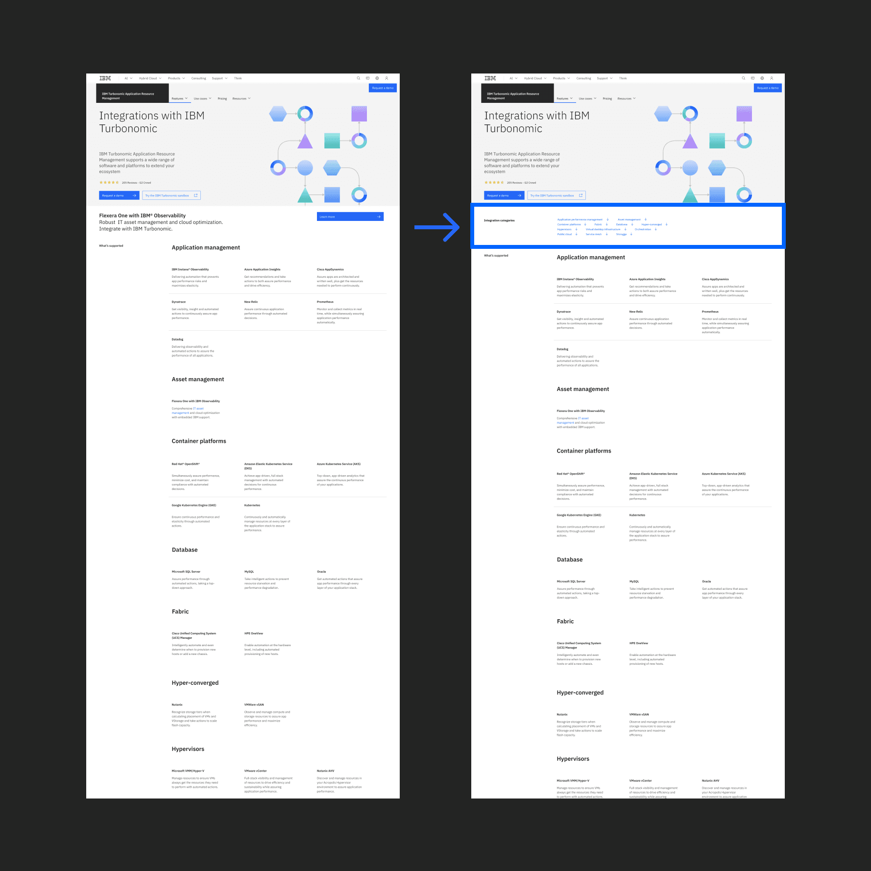
UX recommendation: Integration page anchor nav
Analysis revealed users struggled navigating the Integrations page, which featured 50+ applications without clear organization. Heatmap data indicated users were interested in specific integrations but had difficulty locating them.
Solution: Anchor navigation was implemented to allow users to skip directly to areas of interest, improving both desktop and mobile experiences. This optimization addressed a critical usability gap while respecting user intent and mobile constraints.
Additional UX recommendations
Beyond the primary experiments, continued analytics review informed strategic recommendations:
Interactive Assets: Introducing animated GIFs and interactive content to increase engagement and reduce bounce rates on key pages.
Industry-Specific Content: Competitive research showed competitors successfully leveraged industry-specific case studies. A recommendation was made to customize content by industry, providing users alternative discovery journeys to understand Turbonomic's value.
These recommendations created a scalable framework for ongoing optimization based on user behavior and competitive positioning.
Outcome
The Turbonomic product marketing site transformation delivered measurable business impact. The team successfully delivered 10 net new pages and established a more cohesive, discoverable product experience. Through strategic UX optimization based on user analytics and experimentation, engagement increased 22% and trial responses increased 213%.
Beyond immediate metrics, the work established a product-led growth framework and continuous optimization methodology. Users now have clearer product discoverability and more intuitive navigation. By continuously monitoring user analytics and iterating based on behavioral insights, the site remains aligned with user needs and competitive positioning, creating a foundation for sustained performance improvement and informed future optimization decisions.