Challenge
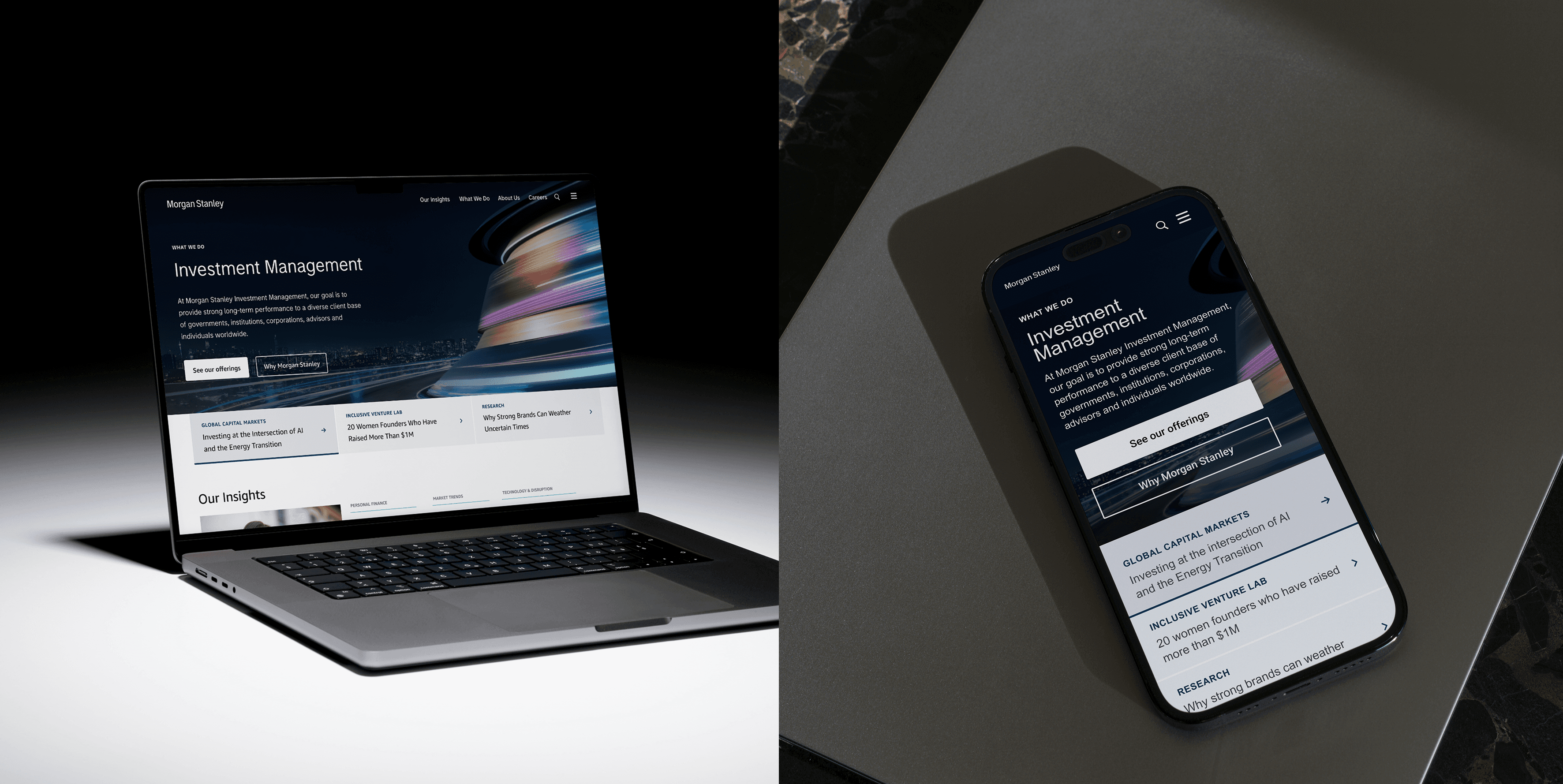
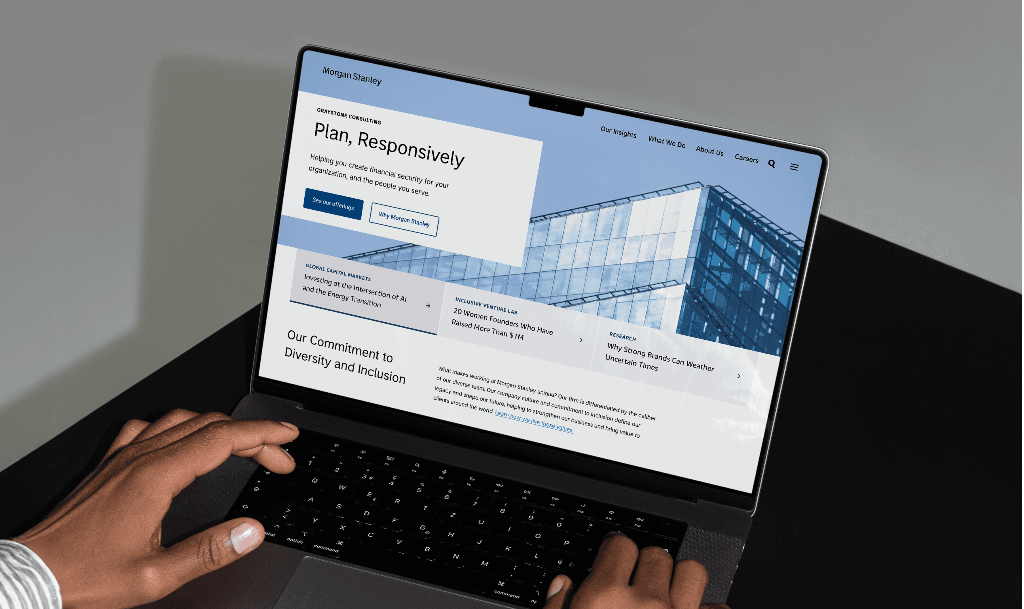
As part of Morgan Stanley's ambitious rebranding initiative, the digital team was tasked with refreshing the public-facing site to reflect a modern, sleek aesthetic while undergoing strategic digital transformation. Given the organization's renewed commitment to digital accessibility and WCAG compliance, the focus was designing accessible, interactive, and engaging button components to ensure a seamless and intuitive user experience across the site.
Team: Insaf Sulaiman | Eugene King | Christobal Oltra | Maria Alcira Gonzalez Silva | Ashwini Kuttappan | Cara Radom
New Brand Design System
A global visual design system was developed to establish Morgan Stanley as a modern and innovative brand with bold, engaging visual language. In close partnership with the Global Brand Studio, the new system was implemented across digital channels. Key improvements included refining the spacing system within components and updating the color palette with accessibility as a priority to ensure consistent, compliant branding.

Responsive Layout & Color Evolution
The digital-first design system prioritized web and mobile experiences. The new spatial framework, built on an 8px base unit system, provides guidelines for creating layouts with consistent rhythm while reducing design decision-making and improving cohesiveness. The brand team evolved the color palette with a modern, sleek blue hue distinctly Morgan Stanley, creating cinematic pairings with photography and accommodating dark mode experiences. All color updates were designed to meet WCAG accessibility standards.

Design Research: CTA Accessibility
During my CTA accessibility research, I focused on best practices to ensure WCAG compliance—critical given the company's regulatory history. Key findings included the importance of providing media player controls for decorative background videos, allowing users to pause content at any time. I also discovered that vague CTAs like "Learn more" create confusion; instead, clear and specific language significantly improves user guidance and engagement.

Button Color Exploration
Color selection became a key discussion point, as the rebranding effort aimed to differentiate Morgan Stanley from other financial institutions using similar shades of blue. Button designs were explored using Skyblue 60, Skyblue 80, and Morgan Stanley Blue 80 as base colors, with all options meeting WCAG accessibility standards.
After stakeholder review, the decision was made to move forward with Skyblue 80—a darker, more modern alternative to the previously used Morgan Stanley Blue. This choice aligned with the new brand direction while complementing the dark mode design the company was adopting.
Button Interaction States
Skyblue 80 button states designed for accessible, intuitive interaction. Distinct visual treatments for enabled, hover, pressed, focused, and disabled states ensure clear feedback while maintaining delightful micro-interactions.
Outcome
Accessible button components were created to meet WCAG compliance while delivering delightful, intuitive interactions. The scalable system supports Morgan Stanley's brand evolution and establishes a foundation for future component development.